Uber · Featured Work
Global App Store Optimization
Uber's App Store presence was a largely untapped opportunity. I worked on the ASO team to transform static screenshots into performance-driven storefront experiences—adapting creative not just for language, but for the culture, products, and expectations of each market. Across Uber, Uber Eats, and Postmates, I designed and localized hundreds of screenshot sets, using A/B testing to identify what resonated with different audiences and scaling successful creative across new markets.
Localization
Designing for Every Market
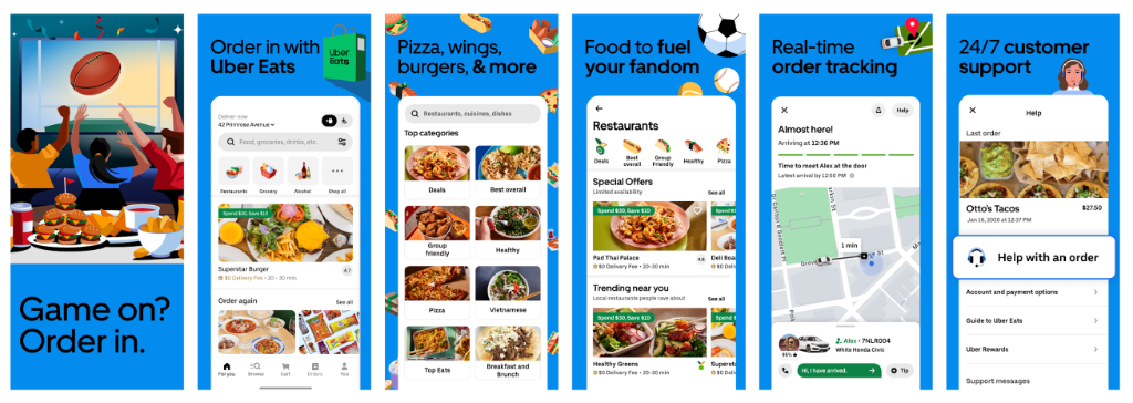
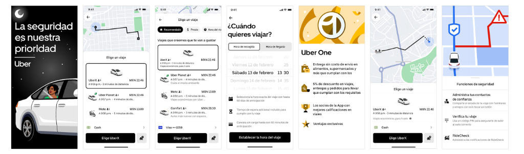
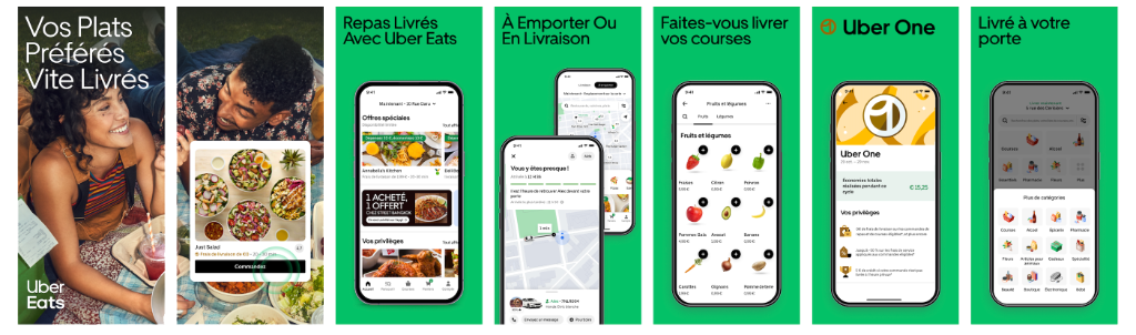
Global localization meant much more than swapping out the copy. Each market required its own considerations: regional product offerings, local currency, culturally relevant imagery, accurate UI, and language that felt natural to native speakers. I worked with regional teams and native speakers to validate copy and ensure each experience felt genuinely localized rather than simply translated. As a designer working across dozens of markets, I also had to keep track of what had been tested, where it had been tested, and which creative approaches were already in market—all while maintaining consistency across Uber, Uber Eats, and Postmates.
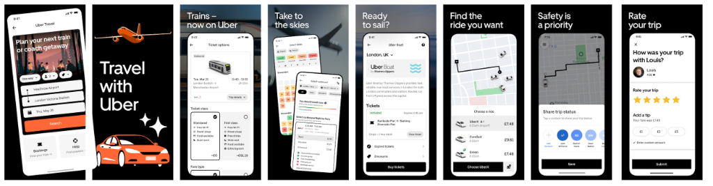
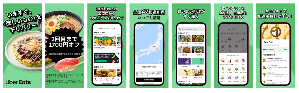
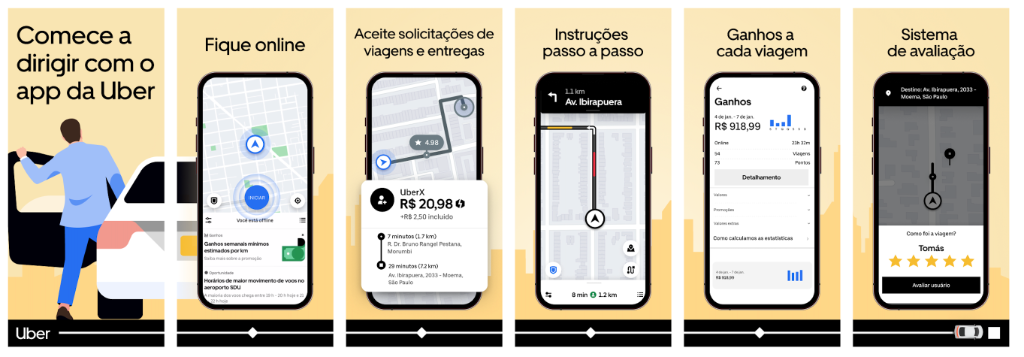
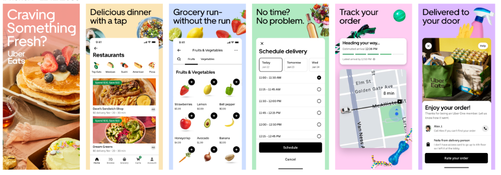
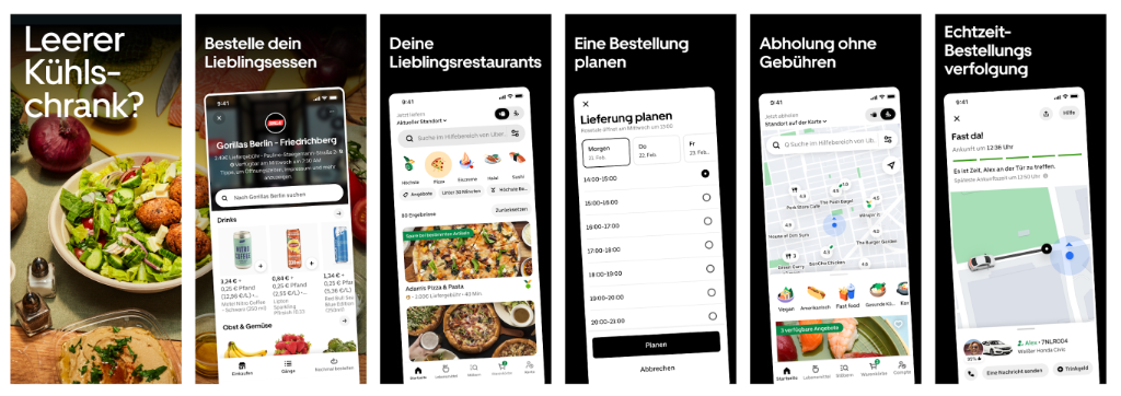
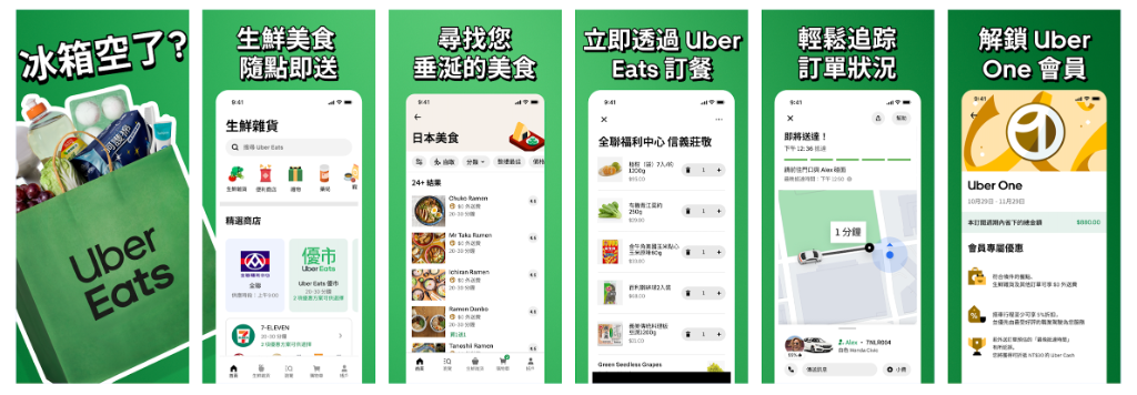
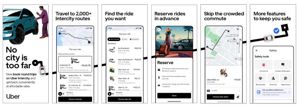
Localization Example
Scaling Creative
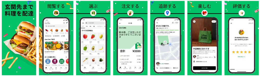
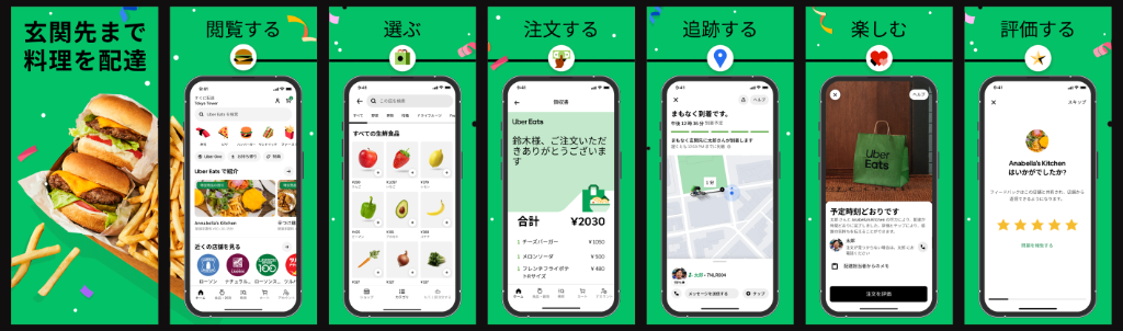
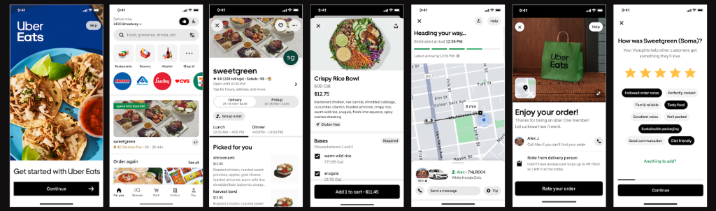
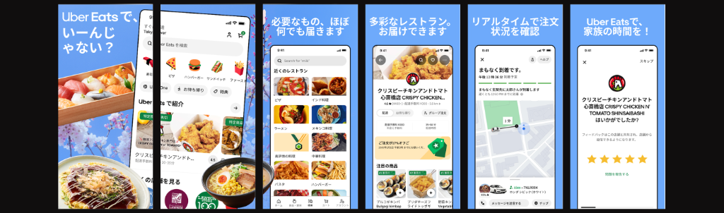
When a screenshot set performed well in one market, we didn't stop there. We tested successful creative across additional countries to see whether the same visual strategy could drive results in new markets. These Uber Eats examples show the same core creative adapted across three languages and markets—demonstrating how a proven design system could be extended globally while maintaining a consistent brand experience.
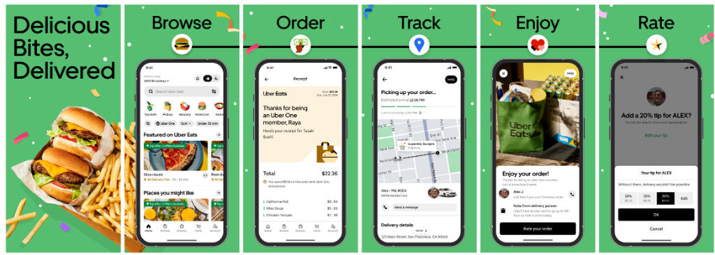
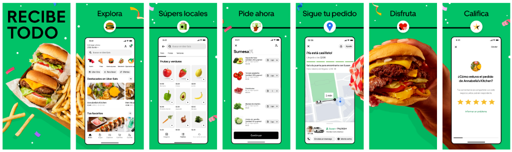
Creative Range
Testing What Makes People Install
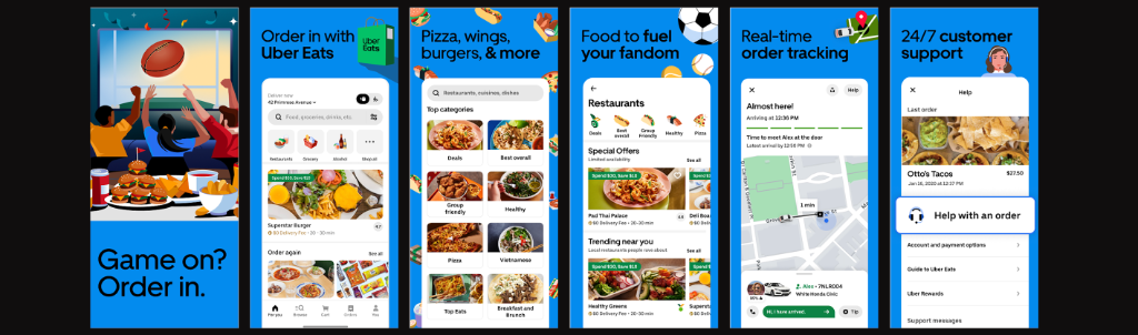
Localization was only one part of the equation. We also tested different creative approaches to understand what motivated users to install. Some sets emphasized photography. Others used illustration, product UI, or different approaches to messaging and visual storytelling. What worked in one market wasn't always what worked in another, making experimentation an essential part of the design process.
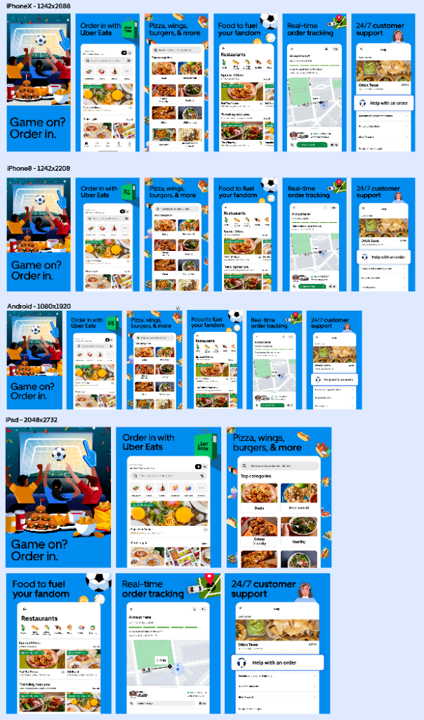
Illustration
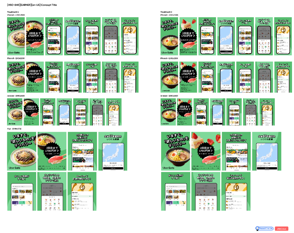
Photography
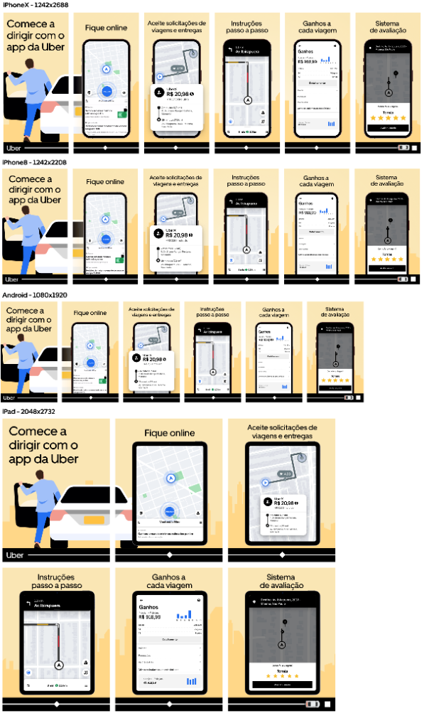
UI / Product
Designed for Every Screen
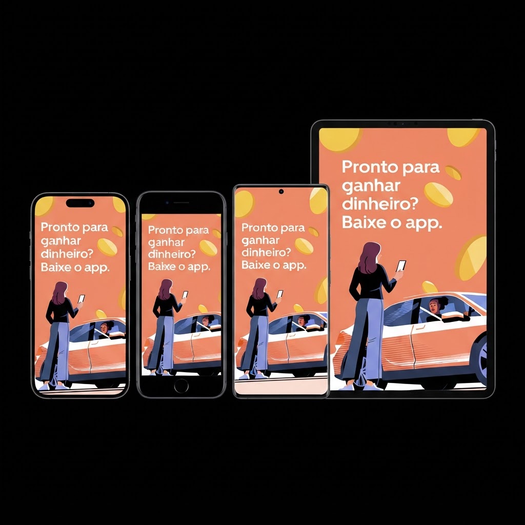
Every screenshot set had to work across the full range of App Store placements and device formats. I adapted each campaign for modern and legacy iPhone dimensions, Android, and iPad—ensuring the composition, typography, UI, and visual hierarchy remained intact as the canvas changed.
- iPhone X
- iPhone 8
- Android
- iPad
Production at Scale
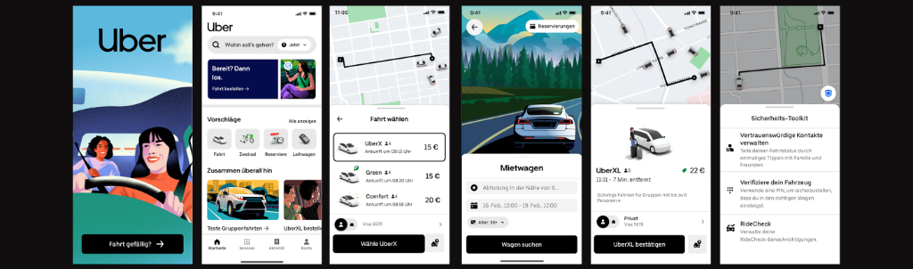
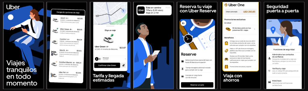
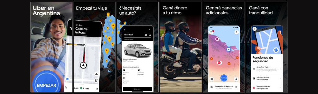
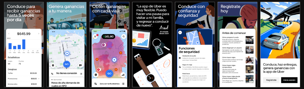
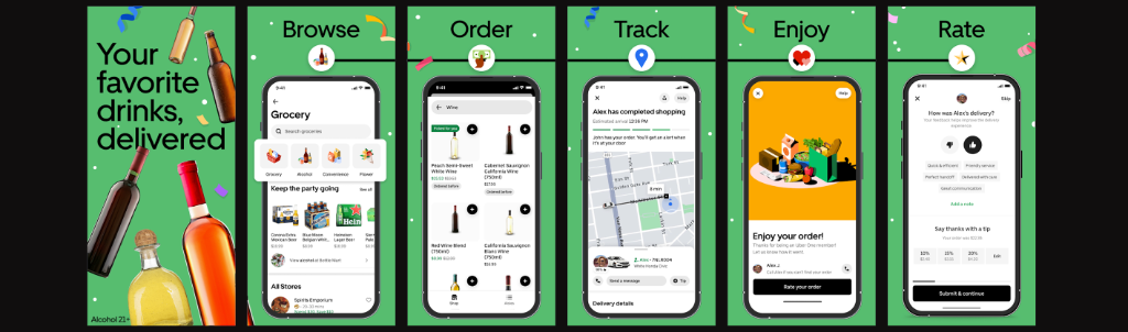
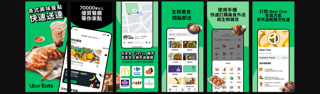
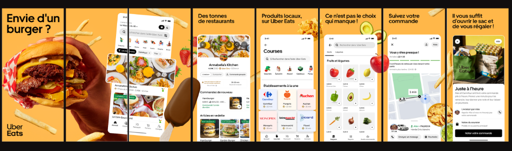
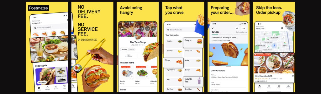
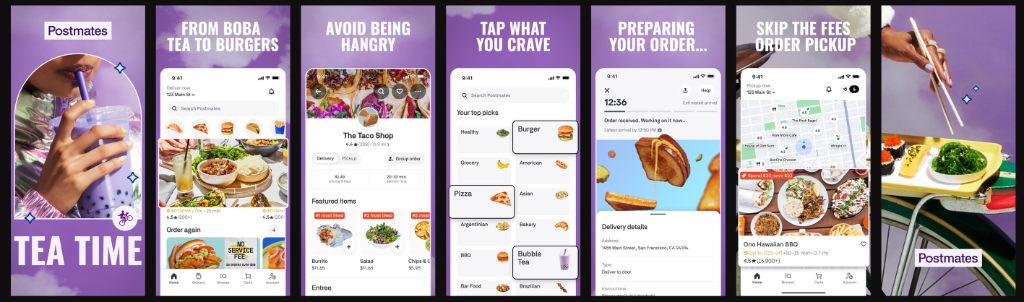
A small selection from more than 350 assets created across Uber, Uber Eats, and Postmates. The work spans dozens of markets, multiple languages, different creative strategies, and a wide range of product experiences. Together, they represent the scale and variety of the ASO system I helped build and maintain.
Beyond ASO
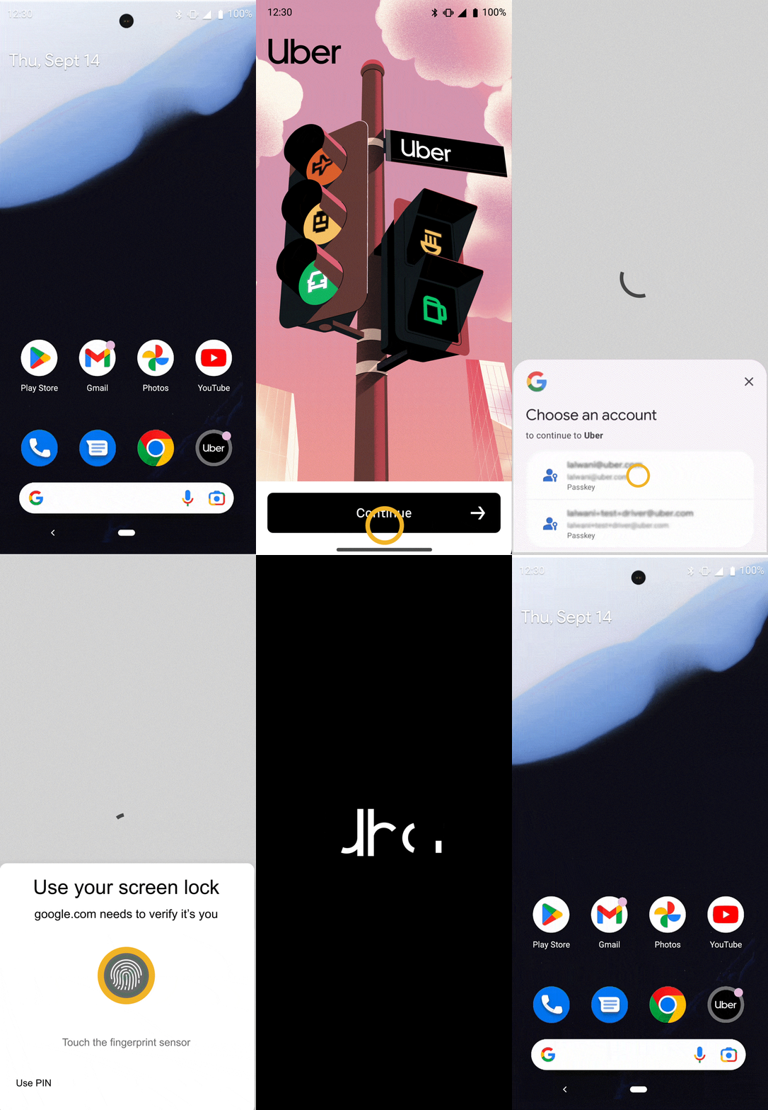
My work at Uber extended beyond App Store optimization. As part of the broader creative team, I also supported product and internal teams with ad hoc motion and visual design projects. One example was a UX animation demonstrating Uber’s new passkey experience, created to help communicate the feature as it was introduced to the product. I also created motion graphics for Uber’s internal Asian ERG for API Heritage Month.
Pass Key UX Animation
API Heritage Month